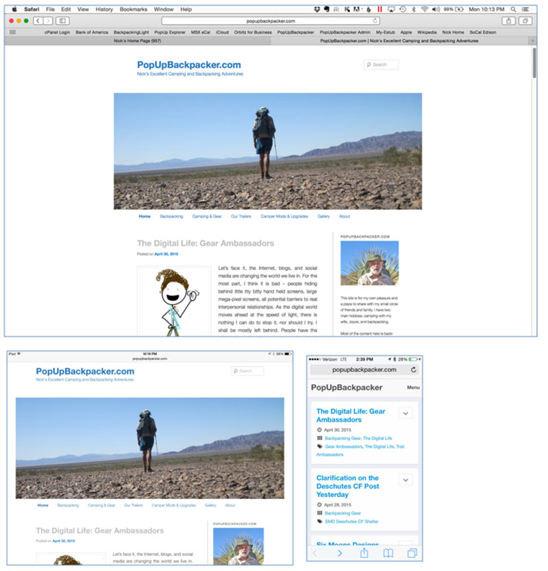
Since I needed to stay home this past weekend to get some things done, I decided to revamp this blog at the same time.
THE WEB
Given that I am so vocal about technology creeping into our lives and diverting our minds and souls from the important things in life, you may wonder why I have a blog and why on earth I would want to spend the time giving it a facelift.
Webshots
This all started a few years ago when Webshots decided to turn itself into a social network, deleted millions of user photo albums and generally self-destructed. I joined Webshots in 2003 as a paid user. I did this for two reasons: first it would be a place to store my photos and second it made it easy for me to post photos on forums at popupexplorer.com where I was fairly active at the time. When Webshots deleted all the albums on its servers, that action also deleted photos from millions and millions of forums, blogs, and websites. This was quite unnerving, as I had been paying an annual membership for nearly 10 years. I decided I would never put myself at the mercy of a technology company.
By 2012 my kids had graduated from college and moved on to real jobs, relationships, and the things adults do. Both moved far from home and I wouldn’t be able see them as often. I figured a blog would be a good way to communicate what I am doing. Plus, a blog would be a challenging task.
PERSONALITIES
 I have come to the conclusion that there are two kinds of people: people-oriented and task-oriented. People-oriented personalities are good communicators and they focus on others. They aren’t detailed oriented. They gravitate to careers that involve sales or interaction with others. Task-oriented folks usually settle into careers such as accounting, programing, auto mechanics; all of which are task-centric.
I am task oriented, which probably explains why my favorite outdoor activity is solo backpacking. This doesn’t mean I can’t or don’t want to interact with others; working with things is just more enjoyable for me. Almost every job I ever had, started out in the task-oriented quadrant and then moved me towards the people interaction side of business. Over the past 17 years my current job has been split 50/50 between coaching, consulting, training, public speaking vs developing products, instructional design, desktop editing, and developing Visual Basic Applications. I can work in either world. But if my boss were to ask me if I want to deliver workshops or develop a new product – I would prefer the later. So the technical aspect of a blog or website was intriguing.
WordPress
 I wasn’t interested in learning how to develop a website from scratch – that would suck up too much valuable time, plus it isn’t a career field of interest to me. So I looked into a template solution. There are many “off the shelf” solutions, such as website construction software or templates that are ready to go and can quickly be plugged into a blog-publishing service. The two most popular were WordPress and Blogger. WordPress seemed larger, had a larger user base, and an entire industry of 3rd party solutions. So I went the WordPress route. WordPress.org will host a blog for free, or one can pay to have their blog hosted by a commercial company.
WEB HOSTING
Any website or blog needs to be hosted on a server. One could actually do this with a dedicated computer at home that would be connected to the Internet 24/7. Aside from the time needed to learn how to do this, a dedicated home-based server wasn’t appealing to me. WordPress and Blogger will host your site for free, but there are many limitations and the chance they could pull the plug like Webshots did to my photo albums. So the logical solution was to pay a company to host my site, and the world is full of companies that do this.
I chose HostGator but there are other popular options too. I have been happy with HostGator and my server has only gone down a couple of times for a short period in the 2.5 years I have been with them. It costs me $15 per year to renew my domain name, which means I own popupbackpacker.com. The yearly fee for HostGator to host my website is $120 per year, with supposedly unlimited storage. If I remember correctly, my plan allows an email system and up to 5 hosted websites. I have no aspiration to build additional websites.
I had decided that WordPress had the best blog templates for my needs and HostGator is pretty much “plug and play” with WordPress. There are an incredible number of free WordPress templates and add-ons that can be plugged into these templates to add additional functionality and extend features. However, the templates are fairly restricted to major manipulation unless the user can program in PHP, which is a scripting language. I’ll get into that later.
WHY RE-DO THE BLOG?
 There were a few things about the layout of my blog that I didn’t like, but there needs to be a discussion about how WordPress works. WordPress is open-architecture system software that is used for blogs. Instead of writing code to create an actual blog within the system software, a compatible template, or Theme as it is called, will integrate into the WordPress system with little effort from the user. The Theme I have been using is named “Twenty Eleven.”
Each year when WordPress releases a major update to their system software, they usually release a new Theme that is supposed to be optimized to take advantage of the new system software enhancements. Currently the popular Themes offered by WordPress are 2010, 2011, 2013, 2014, and 2015; all of which are normally spelled out. Theoretically a user can just switch to a different template and move forward. Yes, all the files are left intact, but things don’t normally play well all the time, especially pictures. So there is usually an investment in time to make sure everything works well. In addition to these Themes that are offered for free by wordpress.org, there are probably thousands of Themes that are available at no cost and you can purchase 3rd party Themes.
When I was investigating Themes for this blog, Twenty Eleven had one of the cleanest looking and uncluttered layouts I could find. It has served me well. It wasn’t perfect and over time a few things stood out that I did not care for.
What I Didn’t Like
The thing I disliked the most was the header. Big black fonts, big borders, and a black menu bar below the heading picture. There was gray around all the edges on the page. The big black fonts in each post’s heading looked harsh to me. Any time a caption was added to a picture WordPress would automatically inserted a thick gray border around it and the caption was left justified with a leading dash, none of which could be changed via the different setting screens.
Most websites have main content that takes up most of the screen real estate, and on one side of the screen a sidebar. My sidebar is on the right side of the screen and was getting cluttered with the listing of recent posts, a list of the most popular posts, a list of some of my favorite blogs and websites, and a archive of posts with a link for each month. The sidebar was growing, growing, and growing as I added content.
The more I looked at the site, the more I wanted to clean things up. Plus it wasn’t ideal on an iPhone. So I decided to make some rather big changes, some which would require me to learn a little bit about the PHP programming language that makes the blog work.
Header
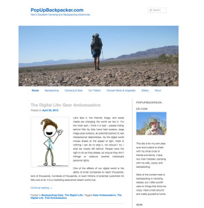
I was able to get rid of all the borders and shading. I changed the Title and Byline from black to a softer shade of blue, which matched the sky in the header image. The menu bar below the picture was changed from white text on a black background to the same blue as the header, and I was able to remove all the borders. I’m thrilled with the result.
Sidebar
There are many changes I made to the sidebar. Some required me to build new pages to hold the content I removed from the sidebar.
About
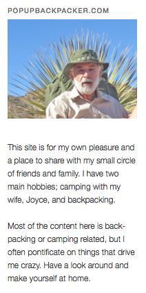
At the top of the sidebar, I decided to add an abbreviated summary of the information that is contained in the “About” page, which is accessed by clicking the About button in the menu bar.
I also added a picture of me leaning against my backpack, which is in front of a yucca whose spines make it look like a devilish halo.
Widgets & Other Stuff
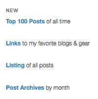
Plugins can be downloaded using the WordPress system software that create “widgets” that can be placed into the sidebar. I removed several that were creating lists in the sidebar – that information may not be interesting to a reader and I could replace all this clutter with just 4 links, should a reader be interested in any of them. The first one I removed was “Recent Posts.”
Recent Posts
This was a list of the last 5 posts that were published. Since I only place an excerpt of each post on the main page, it is easy to scroll down to view each excerpt and then open it if it sounds interesting.
Many bloggers place their entire post on the main page of their website. So the reader can scroll down and see post after long post to find something they might be interested in. More importantly, posts normally have pictures in them, so the page can load very slowly. To me blogs with the entire post on the main page just look too cluttered.
Popular Posts
 The Popular Post widget would insert the 10 posts with the most views during the past 7 days. I really didn’t like it. Often new posts would populate it, although there were many older posts that, day in and day out, get views that people may want to read, but not search through the blog to find them. I found a plugin that would create a listing of the Top 100 posts of all time. Instead of listing the Top 100 in the sidebar, I created a new page to hold the Top 100 and entered the code to activate the list on the page itself. The list is updated each time a visitor views the Top 100 Posts of all time page. I truly enjoy the look of this page.
Blog Roll
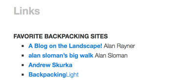
A blog roll is a list of the author’s favorite websites and blogs with a hyperlink to each. This list can take up a lot of space in the sidebar. I didn’t like the list in my sidebar, so I created a new page with my favorite links on it and replaced the blog roll with a single line, Links to my favorite blogs & gear.
Archives
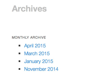
This widget would list every month that had a published post, meaning that it had grown to 30 items and each month another item was added to the list. So I removed it and replaced it with a single link, Post Archives by month, which will take the reader to a page with each month’s archive. Much cleaner.
Listing of All Posts
At the very top of the page is a search box that can be used to find any word or phrase in any post.
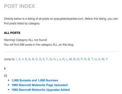
This can be handy at times, but for my own use I wanted an alphabetical listing of every post and another listing of every post by category. This can be found using the Listing of all posts link.
Visitors
This had been at the top of the sidebar and probably isn’t of interest to many readers. But I like it, so I moved it down.
Categories
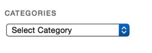
When a post is created it can be assigned to one or more user created categories. If figured people might want to look at all posts in a given category, so there was a list of categories in the sidebar, that once clicked on would show all posts in that category. There were 17 categories in that list. I replaced it with a pull-down menu.
Social Media Buttons
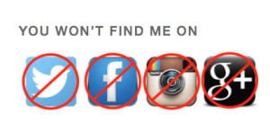
If you have read a few of my posts, you may have noticed I have a dislike, hatred, aversion, loathing, detestation, revulsion, and am overall critical of social media. However most blogs I read theses days have buttons for social media sites so you can Like them, twit them, collect them, link them, endorse them, pin them, or whatever else these social media do.
So I decided to add my own personal media buttons.
Follow Tools
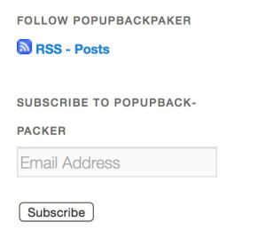
In the beginning a couple friends asked if I could add some way to subscribe to new posts so they wouldn’t have to constantly check for new content. So I added these doohickeys, that apparently work.
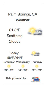
Weather in Palm Springs
Friends tell me they like this one, especially in summer when temperatures can go over 120F, so they can see how miserable we must be. I think of it as keep out sign – people won’t ask to visit because they know it is brutally hot.
Post Headings
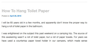
I have always thought the bold black headings for each post was just too “loud” looking. I wanted something a little quieter or subdued.
At first I thought of changing the font size, not an easy thing to do, but after some consideration I decided to play around with the color and actually liked this gray better than changing or reducing the font.
Colors and Lines
Things were starting to look much better. Now I removed all background, border shading, and lines; except the lines between each post. Walla, almost perfect. Clean, understated, but elegant.
The was so much white space though, the side bar wasn’t that distinguishable from the main content of the page. So I added a line between the main content and sidebar. Perfect.
I am totally pleased with the result. Simplicity.
Pictures & Images
Now all the pictures and images do not have the awful gray border when a caption is added. Also the leading dash is gone, and the text is centered.
Smart Phones and Tablets
The site wasn’t especially appealing on iPhone and I’ll assume on most smart phones. I played around with a couple plugins that make a WordPress site mobile friendly, but they did weird things to a tablet, like an iPad. Twenty Eleven in it’s native mode uses a responsive screen, meaning that if it detects a mobile device, it places the sidebar at the bottom of the page, which may not be the best idea. My iPad, which has a Retina screen, can present a full web page just fine, actually it looks better than most laptops. So with a little programing code I forced WordPress to allow iPads to view the full screen.
For all other mobile devices, I installed WPTouch Pro, and plugin that is probably the best of what’s available.
TECHNICAL STUFF
I’m not inclined to get into a lot of detail here. But if you want to tweak a WordPress Theme, there are 3 ways to do it.
- The Theme’s built-in customization settings.
- Install a plugin, which may or not be compatible with your version of WordPress or could be incompatible with other plugins.
- Change or add code in the Theme’s Style Sheet, which is where the code is kept along with many other little files.
The first two are pretty straightforward and not difficult to do. The last can be hard, unless you do this kind of thing for a living.
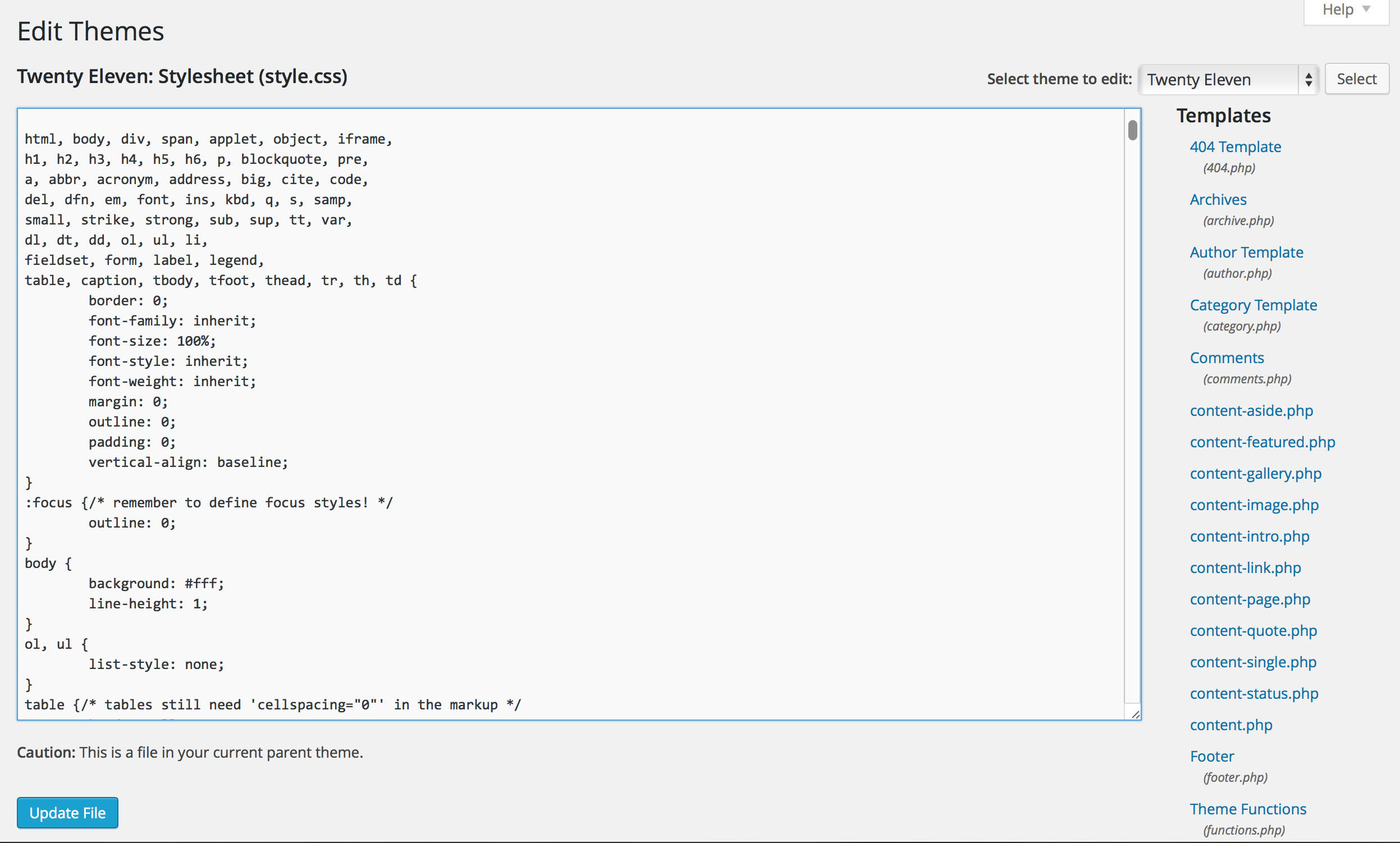
This is the most important thing – if you change the programing in the Style Sheet or another folder, you can cause damage your website. The best method is to create a copy of your Theme. WordPress call these Child Themes. If you damage your Child Theme, you can revert back to the original theme with a simple click of the mouse. I have two themes now; Twenty Eleven and Twenty Eleven Child. This is the most important thing for you to know if you want make modifications to your blog. I can’t teach you how to program in PHP or CCS, that is what Google and Amazon are for.
