No, this isn’t about pictures or paintings related to backpacking or the outdoors, but aesthetic industrial design. Equipment or clothing that is functional and whose form is pleasing to look at. Its form follows its function. The technology may even elicit a pleasant emotional response.
Normally clothing might be considered fashion more than industrial design, but the clothes we wear in the wilderness in extreme conditions are really technology. So I’ll include clothing.
This post will consider these elements and design in backpacking gear and see if there are any outstanding examples of these principles.
Industrial Design
If we really think about our backpacking gear, each item we carry and the pack itself is just a tool. Tools that enable us to be self-sufficient, warm, dry, and safe; whether it is a weekend trip, a multi-week or even a multi-month adventure. Each tool has a specific purpose and some tools may have multiple uses.
Form Follows Function
This is a design principle popularized in the late 19th and early 20th century related to architecture and and industrial design that advocates that the shape of an object or building should mainly create a connection to its purpose or function.
The phrase, form ever follows function, was coined by the sky scraper architect Louis Sullivan in 1896, who wrote:
Whether it be the sweeping eagle in his flight, or the open apple-blossom, the toiling work-horse, the blithe swan, the branching oak, the winding stream at its base, the drifting clouds, over all the coursing sun, form ever follows function, and this is the law. Where function does not change, form does not change. The granite rocks, the ever-brooding hills, remain for ages; the lightning lives, comes into shape, and dies, in a twinkling.
It is the pervading law of all things organic and inorganic, of all things physical and metaphysical, of all things human and all things superhuman, of all true manifestations of the head, of the heart, of the soul, that the life is recognizable in its expression, that form ever follows function. This is the law.
When form does not follow function, things like this “flamboyant” Gothic cathedral, which was built in Prague in the 14th century results. Much of it has no functional purpose.

Dietmar Rabich / Wikimedia Commons / “Prag, Prager Burg, Veitsdom — 2019 — 6662” / CC BY-SA 4.0
Louis Sullivan applied his concept of form ever follows function in this early skyscraper built in 1891 in St. Louis, called the Wainwright Building.

This image is licensed under the Creative Commons Attribution-Share Alike 2.0 Generic license.
Louis Sullivan’s most famous apprentice, Frank Lloyd Wright, was known for integrating design elements into the structure, windows, fixtures, carpeting and other interior features. Wright also incorporated new materials to achieve his design goals. For Wright, expansive use of windows were used to minimize the separation between the interior and the exterior of the building.
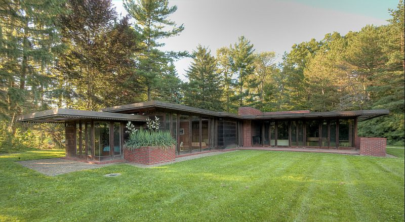
The Weltzheimer Johnson House designed by Frank Lloyd Wright, image by Dirk Bakker, Allen Memorial Art Museum, Frank Lloyd Wright – Wikipedia Commons
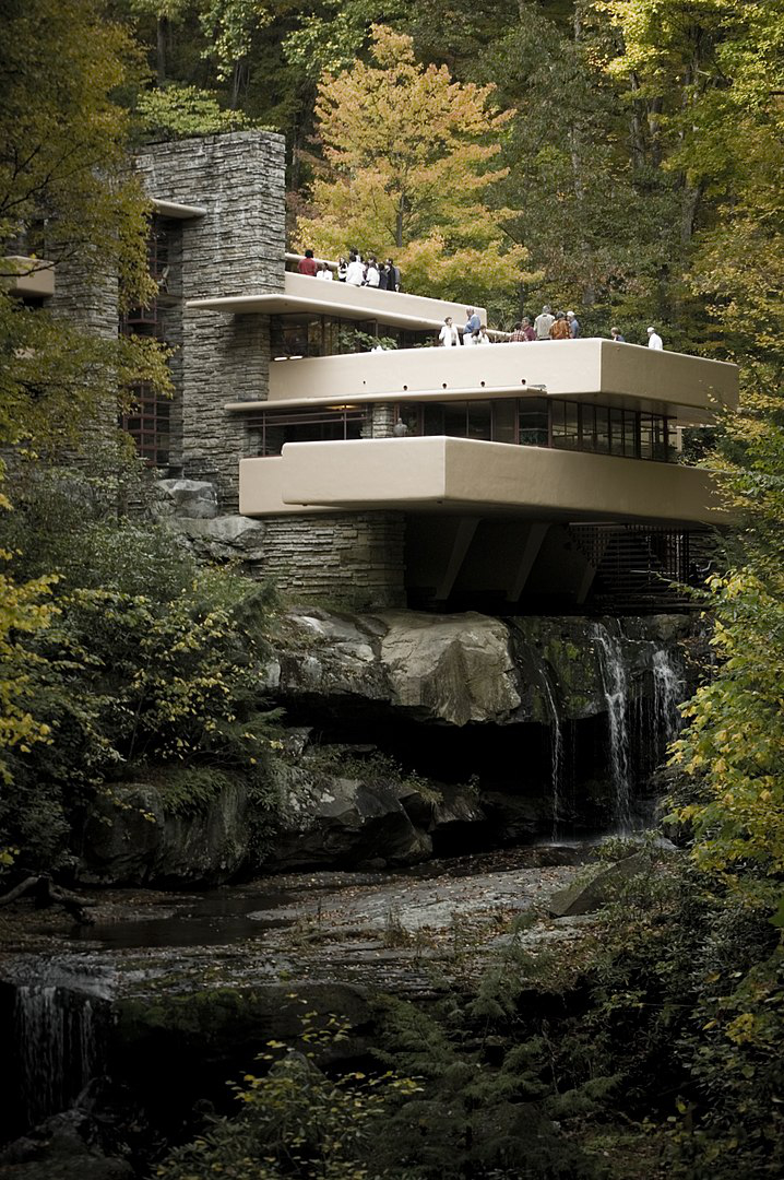
Falling Waters House designed by Frank Lloyd Wright, image by Sxenko, CC BY 3.0, https://commons.wikimedia.org/w/index.php?curid=3171223
The Bauhaus Movement
A major influence in the 20th century, the Bauhaus Movement sought to combine and unify art with mass production with an emphasis on function. Not only should an object’s form follow its function, but art should be unified with with function and form. Summarized, the credos of the Bauhaus Movement are:
Form Follows Function
Less is More
The movement influenced many famous designers such as Frank Lloyd Wright, and the two brothers Ray and Charles Eames.
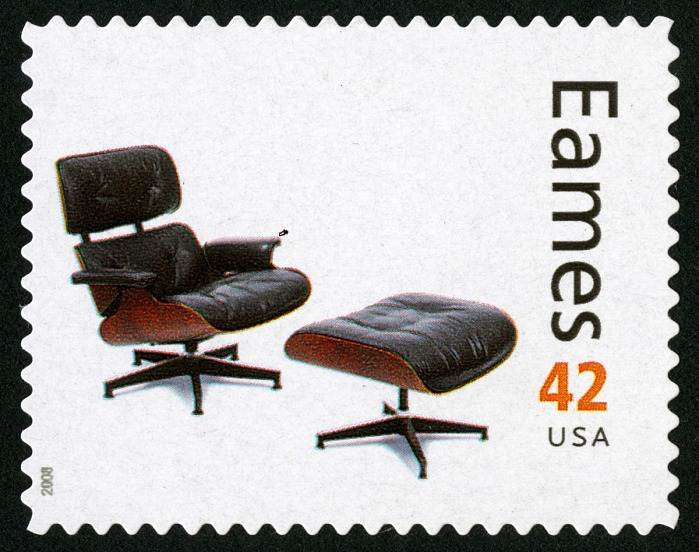
This commemorative sheet of stamps was issued by the USPS in 2008 honoring Charles and Ray Eames.
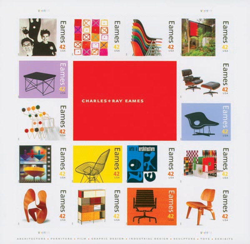
One of the stamps shows the iconic Eames lounge chair and ottoman constructed mostly from plywood and leather.
Steve Jobs
The Intersection of Technology and the Liberal Arts
When we discuss industrial design, Steve Jobs stands on the shoulders of those before him.
Jobs felt that design should be simple and fun. Easy to use. A 1977 Apple brochure proclaimed, “Simplicity is the ultimate sophistication.” Jobs also believed that the interior design of a product, unseen to the user, should also be simple and clean. He felt that Apple’s products should combine craftsmanship, simplicity, and an emotional expression. All of this, including the underlying software, should be well integrated, which led to the integration of a closed system of technology, software, and hardware. Instead of trying to explain his philosophy of designs, I’ll let some of his quotes speak for him:
“It’s really hard to design products by focus groups. A lot of times, people don’t know what they want until you show it to them.”
“We tried to make something much more holistic and simple. When you first start off trying to solve a problem, the first solutions you come up with are very complex, and most people stop there. But if you keep going, and live with the problem and peel more layers of the onion off, you can often times arrive at some very elegant and simple solutions.”
“People from technology don’t understand the creative process that these companies go through to make their products, and they don’t appreciate how hard it is. And the creative companies don’t appreciate how creative technology is; they think it’s just something you buy. And so there is a gulf of understanding between the two of them.”
And the essence of his design philosophy . . .
“Technology alone is not enough. It’s technology married with the liberal arts, married with the humanities, that yields the results that make our hearts sing.”

Tools
I stated earlier that backpacking gear and clothing are just tools. When we think of tools, we think of such things as wrenches, hammers, saws, etc. And yet it was my first purchase of a set of mechanic’s tools that fist piqued my interest in industrial design.
As a young man I decided to become an auto mechanic. After serving an informal apprenticeship under the tutelage of my employer, Bob Lee, it was time for me to purchase my own set of tools. Bob was my mentor and is a dear friend 50+ years later. A man who not only guided my automotive education, but who instilled best business practices and ethics into my psyche.
Professional grade tools are expensive. A complete set of professional automotive tools today cost in excess of $50K. In 1972 they were also expensive.
At the time I told Bob that Sear’s Craftsman brand tools had a lifetime warranty at a fraction of the cost. He gave me some valuable insights.
First, a warranty doesn’t help you if you are working late at night and have a deadline to meet, when an inexpensive tool breaks. Professional tools, such as Snap-on just don’t break.
Secondly, not only are quality tools stronger, but they are lighter and thinner. Wrenches are well balanced, easier to hold, and will fit into tight quarters unlike cheaper options.
Lastly, quality tools are an investment. They are meant to last a lifetime and more. His last advice was to never, ever sell your tools. Once you have a trade, you can always find a job, even if you decide to change professions.
Take a look at these Snap-on 1/2” and 9/16” combination wrenches. I bought them in 1972 and used them daily for nearly 30 years. I still have both along with all my tools (remember, never sell your tools). 51 years later, they are still in use by me.
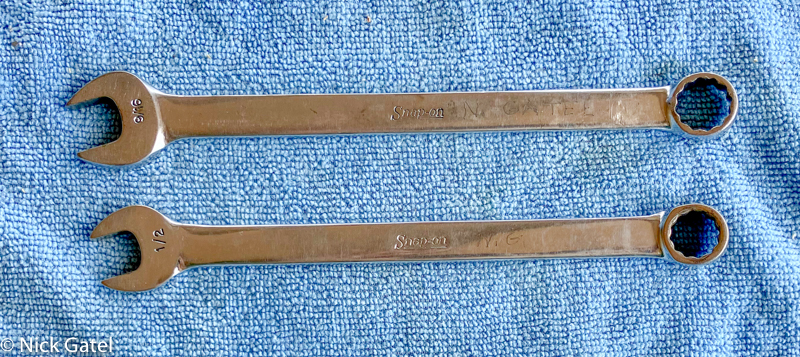
The finish is still good. The markings are small and legible, meaning the wrench doesn’t collect dirt and grease. The finish is so tough that it was difficult to engrave my name on them with an engraving tool.
Backpacking Art
I’ve been at this backpacking thing going on 60 years. Unlike some, I still have gear I use that is older than many folks reading this, A few items are more than 50 years old and still work like new. As I have mentioned many times, there are 3 things I look for in my gear:
- It does what it is supposed to do
- It is durable
- It is reasonably light
The True Pieces of Art
There are Three pieces of gear that I feel are true pieces of art. Going along with Steve Job’s design principles, they do what they are designed to do, they are simple and easy to use, and they have an “emotional” connection — they are items you just want to pick up and use — and lastly they they integrate a great amount of functionality.
#1 Mountain Laurel Designs’ TrailStar Shelter
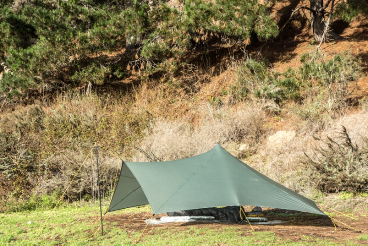
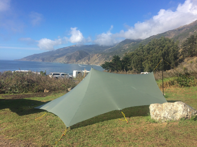
If we look at the credos of the Bauhaus Movement, Form Follows Function and Less is More, I think the TrailStar has nailed it.
It seems to be floating above the ground. To me it is absolutely beautiful.
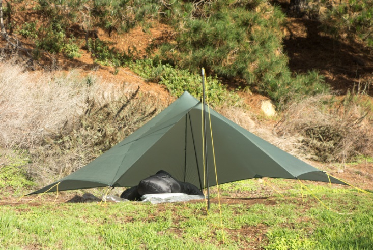
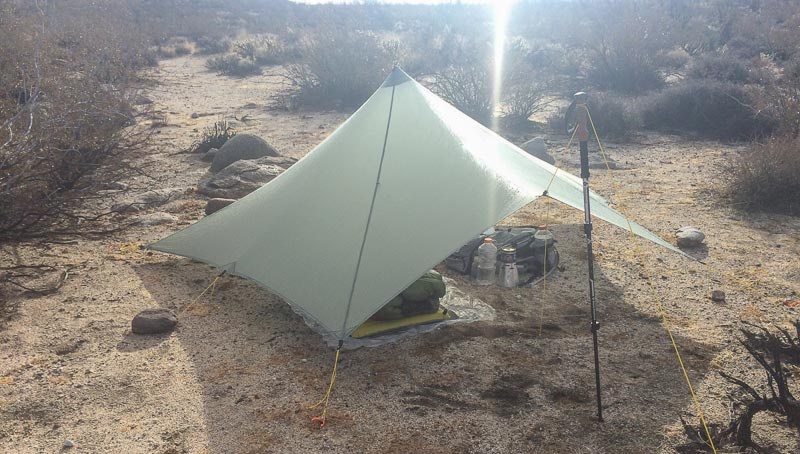
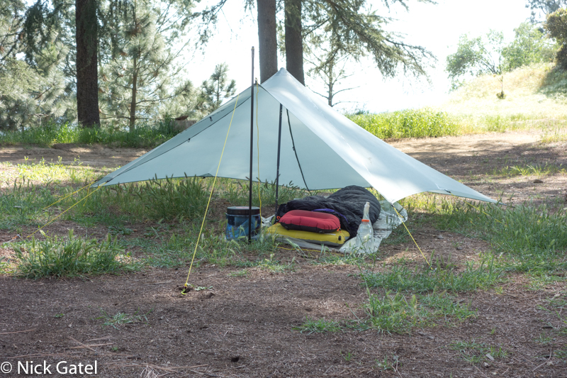
There are no zippers, no windows, no floor, and it doesn’t even come with tent poles. It is designed to use trekking poles, which most backpackers these days tend to carry already. Instead of a pair of trekking poles, one could use a hiking staff and a stick or a couple of light weight carbon fiber poles.
Regarding the lack of a floor . . . experience dictates that a shelter, even with a floor should be set up in a spot with good drainage. Look at the picture above. The ground slopes away from the center in all directions. I am always able to locate a campsite that won’t become a puddle of water when it rains.
The guyline attachments are simple LinLoc3 adjusters.
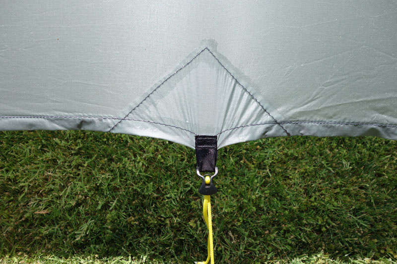
I bought this shelter in 2013 and mine is made from SilNylon, which is made by impregnating a thin woven nylon fabric with liquid silicone from both sides. The fabric stretches and it is this ability to stretch that allows the shelter to be set up very taut.
Because it is a 5-sided pyramid, it easily sheds wind — even severe winds.
It is lighter than most “one man” UL shelters on the market, but is spacious inside with approximate 65 SqFt ( 6+ SqM), although the space near the edges doesn’t allow much height, depending upon how it is pitched, that is, how high the center pole is set and how long the guylines are.
I won’t say the TrailStar is my favorite piece of equipment. Or that it is my favorite shelter.
But as I wrote in this post, If I Could Have Only One Shelter It Would Be A TrailStar. If I am expecting really poor weather — I take the TrailStar — which includes longer trips where weather forecasts aren’t reliable. It has served me well for over 10 years without any wear or issues.
My backpacking style is to only use a shelter if it is going to rain, snow, or become windy. Otherwise, the shelter stays in my pack. But given is size and shape, the TrailStar can be set up in all kinds of configurations to include a nice ventilated shade structure.
This is my first impressions of the TrailStar written over 10 years ago.
As far as I know, the TrailStar can only be purchased directly from the manufacturer Mountain Laurel Designs. Also note that there are now two materials available (SilNylon has been discontinued), SilPoly or DCF (formerly known as Cuben Fiber). DCF doesn’t stretch, which isn’t a great thing for shelters like the TrailStar. To get a taut pitch everything has to be positioned perfectly — angles of the shelter, guylines and stakes. If I were in the market for a new one I would opt for the SilPoly and avoid the DCF. That would be my personal decision and others may disagree.
#2 Gaz GlobeTrotter Stove
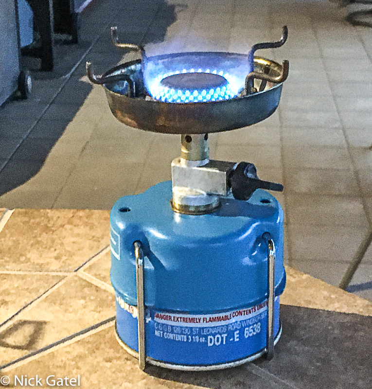
Alas, the stove is no longer produced. It was killed off when the canisters became obsolete, mostly due to government regulations.
It Does What It Is Supposed To Do
One major problem with backpacking and even camping stoves is they often don’t work well in windy conditions. The GlobeTrotter came with a built-in windscreen. The windscreen isn’t going to work in 30 mph winds, but for its time, and even compared to most modern stoves today, it does well in moderate wind. Besides, in windy weather you need to cook behind something protecting you from the wind.
It is easy to light. The canisters of the time were filled with butane, which don’t work worth a damn in freezing temperatures, although there are techniques to minimize cold conditions.
Durable And Reliable
My GlobeTrotter stoves (I have two of them) are almost 40 years old and I still use them. They have been used a LOT. I guess that is the definition of durable and reliable.
Integration

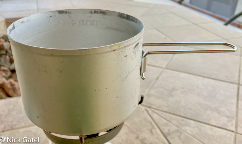
The stove is a complete package. It comes with two 20 ounce pots and the stove with the canister attached fits into the pots. One pot has a slightly narrow diameter so the pots stack together tightly holding the entire kit nice and snug. It also comes with a detachable pot handle. The nylon strap and closure hardware is top notch. In fact, it is the nicest nylon strap I have ever seen.
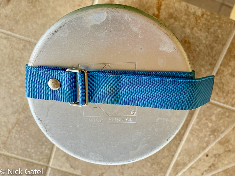
Lastly there is room inside to store a BIC lighter and even a small cleaning cloth or sponge.
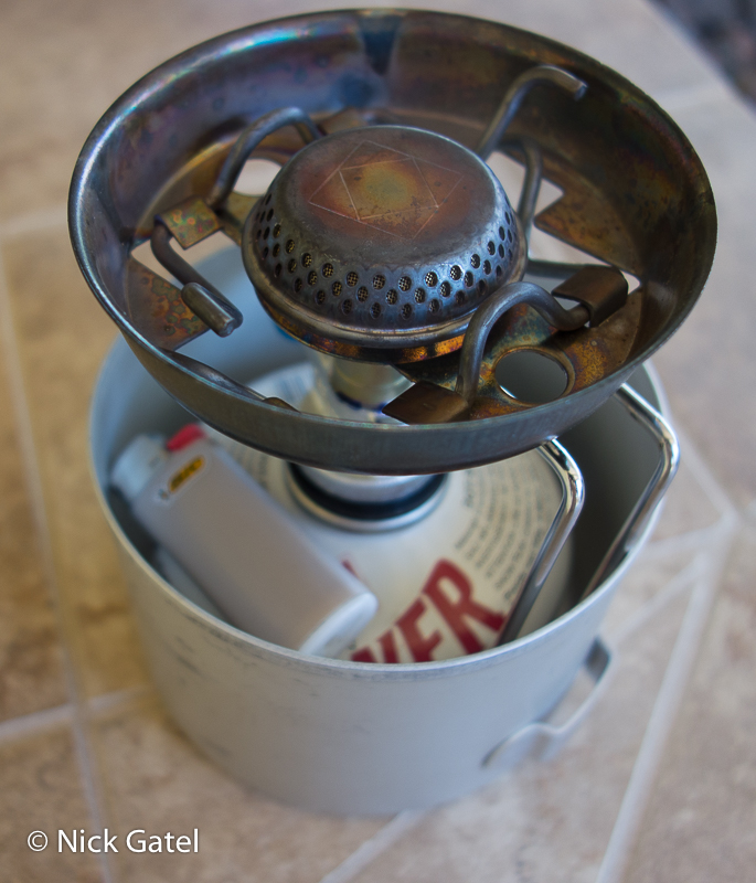
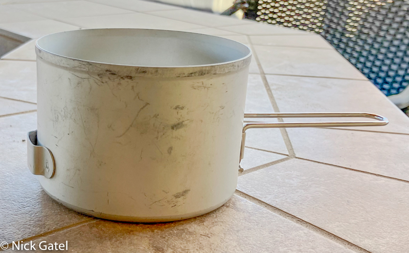
A single 20 ounce pot is perfect for my style of cooking, which is usually boiling water for my freeze dried meals. Most of my freeze-dried meals need 16 ounces of water. Since the pots are fairly wide at 4 inches versus 3 inches in height, they are easy to actually cook food in, which I have done many times.
The detachable handle turns on pot into a drinking cup while the other one is used to heat water for a meal or actually cook with it.
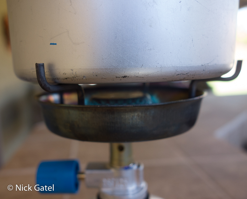
The stove pot supports fold down below the windscreen for transport.

The stove’s pot supports keep the pot securely in place.

Light and Compact
For its time it was a lightweight kit. Even today its weight is lighter than some of the most popular integrated backpacking stove kits today.
- Stove weight: 10.62 ounces (301g)
- Pots, handle and nylon strap weight: 6.03 ounces (171g)
- Stove, pots and handle weight: 16.65 ounces (472g)
- Gaz CV106 butane canister weight: 5.72 ounces (162g)
As it turns out, the lack of the original style fuel canisters isn’t a problem. As I shared in my Gaz GlobeTrotter 35 Year Review, I was able to switch out the stove burner assembly with a modern unit and now can use the common IsoPro canisters and still fit everything into the pots!
The review provides detailed instructions on how I upgraded my stove using an inexpensive Coleman backpacking stove. One might be able to find an old GlobeTrotter in a thrift store, garage sale or on eBay.
https://www.amazon.com/gp/product/B01B3NO4NQ/ref=ppx_yo_dt_b_search_asin_title?ie=UTF8&th=1
This website may be compensated for linking to other sites for sales of products. As an Amazon Associate I earn a small fee from qualifying purchases at no additional cost to the purchaser.
Weights with upgraded stove body:
- Stove, pots, handle and nylon strap weight: 11.0 ounces (312g)
- Stove weight with updated stove body: 4.97 ounces (141g)
- Pots, handle and nylon strap weight: 6.03 ounces (171g)
- Snow Peak IsoPro canister 7.40 ounces (210g)
Comparison to Current Popular Integrated Stoves
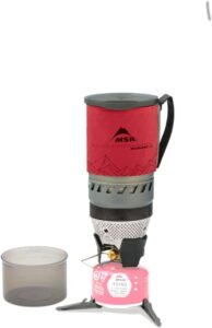
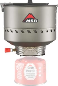
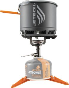
There are three very popular integrated stove systems today — the MSR WindBurner Personal System, MSR Reactor and the JetBoil Stash. Both come with an integrated pot. I haven’t used either, but am confident that the MSR WindBurner is much better than the GlobeTrotter in windy conditions. So why haven’t I bought one of the new versions? Let’s compare some specifications:
MSR WindBurner Personal System
Pot capacity: 1 Liter (33 ounces)
Total weight of stove, pot and components (without a fuel canister): 15.3 ounces (430g)
MSR Reactor 1L Stove System
Pot capacity: 1 Liter (33 ounces)
Total weight of stove, pot and components (without a fuel canister): 14.9 ounces (420g)
JetBoil Stash .8L Stove System
Pot capacity: .8 Liter (27 ounces)
Total weight of stove, pot and components (without a fuel canister): 8 ounces (227g)
A visual comparison of the five integrated backpacking stoves:

To me the GlobeTrotters stoves have a nice aesthetic appearance. Simple and clean lines and the function is apparent. The GlobeTrotter looks to be more stable than the other three I have used as a comparison. The other three have a dark sinister look of something one might find in Gotham City.
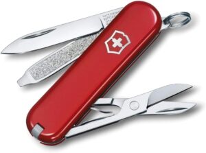
#3 Victorinox Classic Swiss Army Knife
It is small, convenient, minimalist and in my opinion, beautiful.
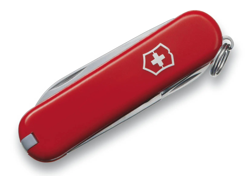
Like Steve Jobs, who insisted that rectangles, whether hardware or a software window, should have rounded corners, the rectangular Swiss Army is almost an elongated oval. When you see it, you just want to pick it up. Job’s would have approved.
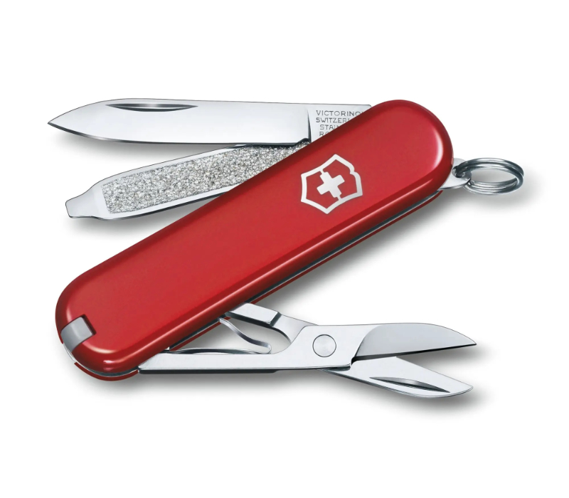
This knife is minimalist, including just a few tools. A knife blade, a file with a tip that can be used as a screwdriver, an incredibly strong and sharp set of scissors, tweezers and a plastic toothpick.
The knife blade is sharp and keeps its edge. The file has many uses. The scissors are my favorite tool. The tweezers excel at remove cactus spines and other thorns or splinters. The toothpick is good for cleaning small items, although I have never used it as an actual toothpick.
The knife has a secure ring attached. You can add it to your set of keys. I use it to attach to a lanyard, that I wear around my neck when backpacking solo, along with an emergency whistle.
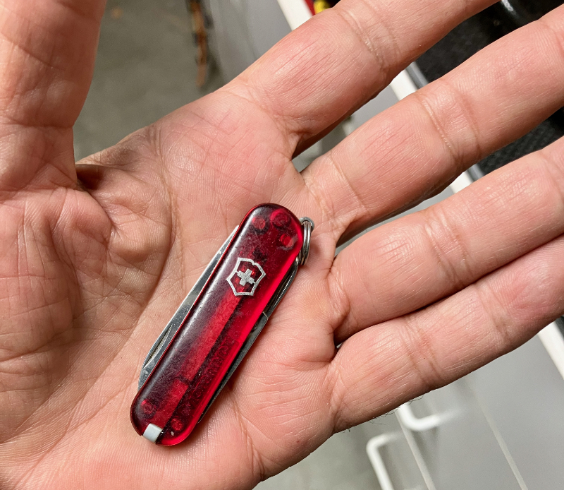
I have collected several over the years, mostly as gifts. On the flip side of this gift coin, I have given many away. They come in various colors. Even transparent colors.
When Art Gets Lost . . .
Here’s an example: A Swiss Army Knife that became bloated with too many tools. An item meant to be a jack-of-all-trades that became heavy, bulky and did few things well.
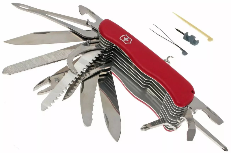
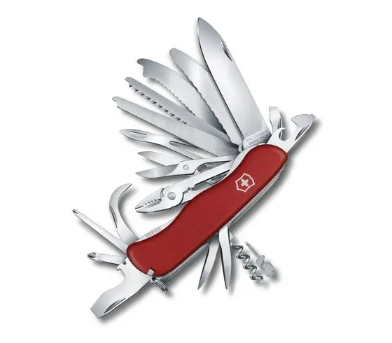
To me this is a monstrosity. A supposed toolbox that includes 30 tools.
The case has lost its elegant rectangular shape with ovals. It isn’t something you want to pick up because of Job’s idea of the intersection of technology and emotion.
Almost Art (Perfect)
Patagonia
No clothing made my list of Backpacking Art. Patagonia was a leader in clothing technology, fit, and quality. Unfortunately they just didn’t execute everything just right.
As you may already know from reading my articles, I really like Patagonia Clothing. I have written several reviews of items I have worn for decades, although some have worn out over time and I have been able to replace them with a newer version.
A few years ago I wrote an article, Understanding Layers Using Patagonia Clothing as a Guide. One thing I found frustrating when putting the information together, was Patagonia had changed much of its layering products and abandoned a sensible labeling system to differentiate its products. But I couldn’t ignore Patagonia’s influence on outdoor clothing and its role in educating the public over the years. It was in their DNA.
Unfortunately, Patagonia has lost their DNA. Not that I am unhappy with their products — quite the opposite. But they have made it difficult to understand their products as it seems they have become an “urban outfitter” that still have some great outdoor gear that works and lasts.
So what are the criticisms?
First they have changed their baselayers. At one time it was simple: Capilene 1, 2, 3, and 4. The lower the number the thinner the material, which made it easy to pick the weight one needed for specific environmental conditions.
Secondly they did the same with their fleece garments. The used to have R1, R2, R3, and R4. Again it was simple to assemble a clothing system.
Third, Patagonia has never seemed to have an insulation (down garments) that could correspond to the same kind of numbering system. Heck they could do something simple such as indicating the thickness of the down in a jacket, with a chart for ranges of temperatures.
Fourth — the Houdini windshirt used to be the Gold Standard. Recent iterations aren’t as breathable and too much emphasis on trying to make them water resistant, which is really just an exercise in futility.
Lastly, Patagonia, unlike other kinds of clothing, hasn’t done anything revolutionary in rain gear. Their waterproof/breathable clothing isn’t, just as no one’s is, as I shared in The Search for the Holy Grail: Waterproof Breathable Rain Gear over 10 years ago. Nothing in the industry has changed in that segment. The answer probably isn’t going to be new materials, but new designs that vent well.
Svea 123
Ah, my favorite stove.
A classic.
A thing of beauty.


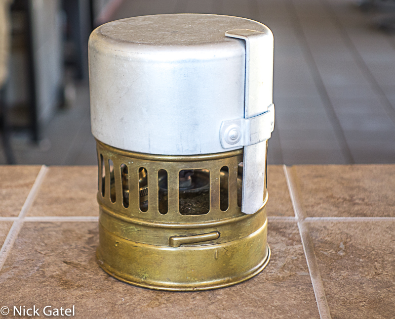
No Integration
The stove came with a pot (or really a cup) that holds 12 ounces. It is too small to be practical for cooking. They could have easily included a larger one of 20 ounces or more that could nest the stove.
Sigg made a lot of money marketing cook outs for the Svea 123, whether just their plain vanilla sets or the specialized sets with windscreens for the Svea 123. But these post were huge.
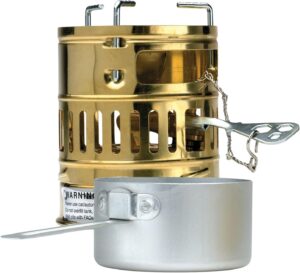
What is really kind of mind blowing it my favorite integrate set, the Gaz GlobeTrotter, has a set of pots that fit the Svea 123 perfectly.
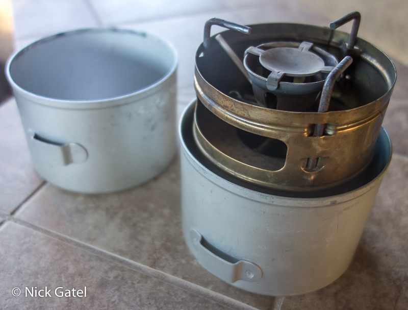
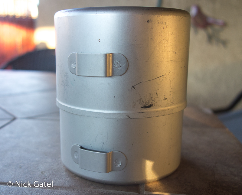
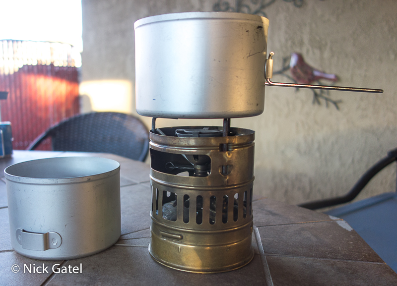
Although the pot supports on the Svea leave a lot to be desired, even when using their own cup. Larger pots work better.
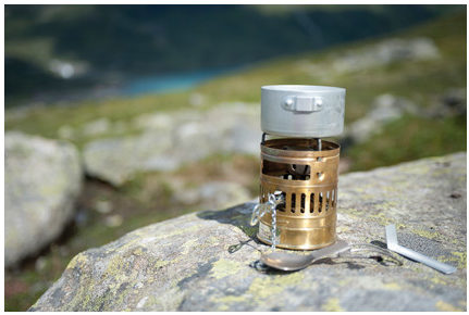
I guess Optimus, the owner of the Svea brand, hasn’t figured all of this out either. The image above is from the Optimus website showing the cup as a pot <sigh>
You can read my Svea 123 long-term review from a few years ago . . .
These deficiencies kept my favorite stove, the Svea 123, off my backpacking art List and instead the Gaz GlobeTrotter was the clear winner and deserving the distinction of being a piece of Backpacking Art.
